This is an old revision of the document!
Basics
User Interface (UI)
General information about website and app
The Kurviger website provides comprehensive information about Kurviger, including details on the website and app, as well as account management options. Both the website and the app feature a main function of a route planner for planning, importing, and exporting routes and circular tours. Premium features expand the planning and display options. Additionally, a cloud function allows for saving and accessing routes and favorite places through one's own account, across both the website and the app.
Exclusive to the app is a special follow mode view where the map follows the location, and premium users benefit from visual and optional spoken guidance along a planned route.
Both the Kurviger website and app offer user interfaces (UI) with necessary displays, information, and controls. Depending on the device and screen size, the layout and operation may vary.
UI – Menu bar, main menu for controlling the website and app, operating language
To select or switch between various tasks (e.g., planning, import, export) on the Kurviger website and app, there is a menu bar and a main menu. The menu bar is sometimes also called a navigation bar, as it allows navigation (control) within the program to the individual tasks. Since the website and app are used on various screen sizes and formats, the interfaces are adapted to these sizes and formats, including the menu bars and main menus.
To learn about the Kurviger website and app in general, read the following sections. For individual information you can go directly to the desired section:
- Control of the website, home screen (menu bar)
- Control of the app, home screen route planning
- Control of the app, home screen in Follow-(Navi Light-) or navigation mode
- Control of the website and app through additional menus and the sidebar
- Select operating language
Menu bar: Control of the website
You can navigate to various sub-pages (e.g. Search, Cloud, Route Transfer, Account) via the menu bar on the Kurviger website. The menu bar is located at the top of the website. This means that clicking on an element calls up the corresponding page or menu. Depending on the selected page and browser display, more or fewer elements are displayed and their arrangement can change.

| Menu bar on the website | |
|---|---|
| A Go to route planning from any view | |
| B Call up the route planner and related pages | |
| C Open various information or administration pages | |
| D1 Log in/log out icon / Account | |
| D2 Menu icon | |
| D3 Language selection icon | |
Menu bar: Control of the App
The Kurviger app serves as a route planner, for example. In addition to the route planner, the Kurviger app also contains a special view for driving, the follow mode. The map follows your location. As a premium feature, visual and optional voice guidance along a route is possible. Your account can also be accessed from the app. You can control the accessibility of these things, for example, via the menu bar and the main menu of the app. The menu bar is located in the route planner at the top of the app, for example. It contains elements with which you can, for example open the main menu and control the Kurviger app.


| Menu bar on the App | |
|---|---|
| A Open Menubar | |
| B Log in/log out icon / Account | |
| i Main menu | |
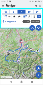
UI – Planning, import, export, cloud, search
The basic structure of the user interface (UI) for route planning (planning, import, export, cloud, search) is described here. This is only intended to provide a general overview. If you need detailed information on the operation itself, we recommend that you take a look at the corresponding topic blocks.
To learn about the structure of the user interface for route planning, read the following sections. For individual information you can go directly to the desired section:
- Map area
- Sidebar
- Widget
- Menus
- Dialogues
- Hiding/showing the sidebar and menu bar
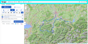
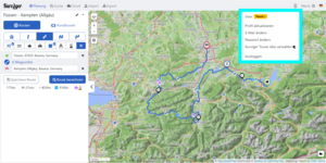
| Map area (Web, App) | |
|---|---|
 |
|
 | The map area is an essential element for route planning and driving operations (e.g. navigation). |
| Depending on the application (e.g. planning, navigation), more is possible in the map area by clicking or tapping. | |
| Depending on the application, additional control buttons and / or information areas are displayed in the map area. | |
| Depending on the application, the display of the map area may be influenced by a sidebar (see below). | |
| Sidebar (Web, App) | |
|---|---|
 |
|
 | The sidebar is an essential element for input, management and info display in e.g. planning, import, export, cloud, search. |
| The sidebar can be hidden / shown to display more or less of the input / info area or the map area as needed. | |
| Depending on the app / web, device and portrait or landscape format, the sidebar is displayed / hidden differently. For website and PC e.g. sideways, for app and mobile in portrait format e.g. from top to bottom, completely or partially. | |
| Picture left: App, sidebar half open Picture above: Web (PC), sidebar shown | |
| Widget (Web, App) | |
|---|---|
 | Widgets are essential elements in the sidebar to make special inputs, trigger functions and / or display information. |
| A feature of widgets is the back arrow in the widget's title bar. The back arrow can be used to close the widget and return to the previous sidebar view. | |
| Picture left: Widget, e.g. waypoint info and input on the web | |
| Main menu (Web, App) | |
|---|---|
 |
|
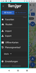 | A main menu is an essential element to start certain actions. |
| Usually, main menus are closed after an action has been selected. However, it can also be closed without selecting an action by clicking / tapping a possibly existing X symbol in the main menu or by clicking / tapping outside the main menu. | |
| A special form of a main menu is the menu bar, e.g. on the web page and PC. This is usually not closed after the selection of an action. The selected action is marked in the menu bar. | |
| Picture left: App, Main menu Picture above: Web (PC), Menu bar | |
| Menu, Context menu (Web, App) | |
|---|---|
 |
|
 | A menu is an essential element to start certain actions. Depending on the call or task of a menu, the menu may also be called a context menu. |
| Menus are usually closed after an action has been selected. However, it can also be closed without selecting an action by clicking / tapping a possibly existing X symbol in the menu or by clicking / tapping outside the menu. Some menus of the app can be hidden / shown by swiping. | |
| Picture left: App, Menu for language selection Picture above: Web (PC), Menu for language selection | |
| Dialog (Web, App) | |
|---|---|
 |
|
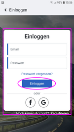 | A dialog is an essential element to start certain actions, make inputs or / and display certain information. A dialog contains e.g. an OK button and / or CANCEL button or a button for a certain action. |
| Usually dialogs are closed after clicking / tapping e.g. the OK or CANCEL button. However, a dialog can possibly also be closed by clicking / tapping outside the dialog or with the back button of the browser or device, changes in the dialog are not taken into account. | |
| Picture left: App, Log in Picture above: Web (PC), Log in | |
| Hiding/showing the sidebar and menu bar (Web) | |
|---|---|
 |
|
| A Click on the flag with the arrow pointing to the left to hide the sidebar. | |
| After the sidebar has been hidden, you can click on the flag again. The arrow points to the right when the bar is hidden and the sidebar is expanded again by clicking on the flag with the arrow. | |
| Hiding/showing the sidebar and menu bar (App) | |
|---|---|
| |
|
| A Click on the flag with the arrow pointing to the left to hide the sidebar. | |
| After the sidebar has been hidden, you can click on the flag again. The arrow points to the right when the bar is hidden and the sidebar is expanded again by clicking on the flag with the arrow. | |
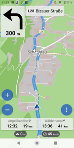
UI – Navigation (driving mode)
The user interface (UI) for the navigation is only available in the Android app! The basic structure of the user interface (UI) for navigation is shown here to familiarise you with it in general. The operation itself is described in the corresponding topic blocks.
To learn about the navigation UI in general, read the following sections. For individual information you can go directly to the desired section:
- Unguided navigation (follow mode)
- Guided navigation (only with Tourer+)
- Navigation simulation
| Unguided navigation (follow mode) | |
|---|---|
 | In Follow-Mode the map follows the actual position of location. |
| No route is required for navigation without guidance (follow mode). You can explore the area without a route. You can follow a route without instructions. | |
| For this the location must be known. | |
| No turn instructions are displayed! | |
| How to start unguided navigation (follow mode) | |
| 1 Go to route planning from any view | |
| 2 Go to route planning from any view | |
| 3 Go to route planning from any view | |
| 4 Go to route planning from any view | |
| Guided navigation (only with Tourer+) | |
|---|---|
 | In Navi-Mode the map always follows the actual position of location. Turn-by-turn directions are displayed and due to setting voice guidance is provided. |
| The zoom level may be adjusted automatically depending on the setting. If map data is missing for areas, these areas are displayed in neutral color (without streets, cities, …). | |
| The location must be known and a route must be available. | |
| When leaving the route due to setting the route can be recalculated automatically or manually. Off the route there are no turn instructions. When you return to the route at a later point (without rerouting) or after rerouting, navigation with turn instructions continues automatically. | |
| How to start guided navigation | |
| 1 Go to route planning from any view | |
| 2 Go to route planning from any view | |
| 3 Go to route planning from any view | |
| 4 Go to route planning from any view | |
| Navigation Simulation | |
|---|---|
 | In this mode navigation is simulated for an existing route, the app behaves like a real navigation, see also guided navigation. |
| How to start navigation simulation | |
| 1 Go to route planning from any view | |
| 2 Go to route planning from any view | |
| 3 Go to route planning from any view | |
| 4 Go to route planning from any view | |
General Elements and Actions
Waypoints, Instruction points, Instructions
| Symbols and declaration of Waypoints, Start, Via Point, Shaping Point, End (Destination) (App, Web) | |||
|---|---|---|---|
| Web, App | Road-book | Waypoint is the main term for points required to calculate a route. Sometimes WP is used as an abbreviation (e.g. in the forum). Currently there are the following waypoints: | |
 |  | Start, beginning of the route | |
| Depending on selected language for website and / or app the term of this point may be replaced by a translated term. (E.g. in german: Start; in french: Départ) | |||
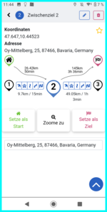
 |  | Via Point, Point on (or at) the route where for example a stopover or Special view is planned | |
Displayed in waypoint list. May be filtered in turn instruction list. Displayed or optionally announced in navigation.  |
|||
| Sometimes VP is used as an abbreviation (e.g. in the forum). Depending on selected language for website and / or app the term of this point may be replaced by a translated term. (E.g. in german: Zwischenziel; in french: Point intermédiaire). | |||
 |  | Shaping Point, Point for route guidance over a specific route section, unintrusive marking | |
| Displayed in waypoint list. May be filtered in turn instruction list. Not displayed or optionally announced in navigation. |
|||
| Sometimes SP is used as an abbreviation (e.g. in the forum). Depending on selected language only in old app the term of this point may be replaced by a translated term. (E.g. in german: Formpunkt; in french: Point de forme). | |||
 |  | End (Destination), Point of end of the route | |
| Depending on selected language for website and / or app the term of this point may be replaced by a translated term. (E.g. in german: Ziel; in french: Arrivée) | |||
| Instruction points, Instructions, Turning points, Turn-by-turn instructions, Turn instructions (App, Web) | |
|---|---|
 | Instruction points, Turning points can be displayed with the route depending on the settings. They are displayed as points on the route. These points are created by routing software and manually not moveable. |
 | In Navigation, turn-by-turn instructions and Instructions are displayed with icons and distance information for the turn points and waypoints. Depending on the setting, the instructions are also output by voice message during navigation. |
| Potentially Closed Roads, Restrictions (Web, App, needs Tourer subscription) | |
|---|---|
  | Symbols for time or vehicle dependent restrictions (e.g. road block at construction sites, weekend driving restrictions) are displayed depending on the setting. The restriction symbol is displayed on the corresponding route section and the route section is highlighted in red. Click on the symbol to display further details on the blockage. |
| |
|
Settings
Various settings allow both the website and the app to be customised to the user's specific wishes. be customised. In addition, information on the status of the OSM database for route planning and on the programme and its surroundings can be displayed.
Depending on the website or app with or without a subscription, there are setting options. To learn about the different setting options please read the following sections. For individual information you can go directly to the desired section:
- Open Settings
- Settings Overview
- POI Settings
- Cookie settings
- Navigation settings (only for app)
There are notes on the individual setting options both on the website and in the app to help you make your choice. help you with your selection.
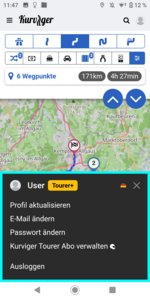
Open Settings
 |
|
 | The settings can be made in the website for the website and in the app for the app. They are managed separately. |
| A (Website) Settings icon in the website toolbar |
|
| A1 (App) Settings option in the app's main menu (to open the app's main menu, see “Controlling the app” above in the documentation) |
|
Settings selection, date OSM database, debug info

| Settings | |
|---|---|
| A Settings selection (Here you can choose which settings you want to want to view or change). | |
| B Date of the OSM database for route planning (shows you the status of the data for the curvy route calculation) | |
| C Debug info (This info is interesting for questions in the forum about certain problems to be able to give appropriate answers) | |
Choose POIs (Points of Interest)
Certain locations (e.g. petrol stations, mountain passes, etc.) can be shown or hidden on the website and in the app. This applies to POIs (points of interest) that are included in the map data. But also for points selected by the user, which can be managed by the user as favourites in the cloud and displayed or hidden by the user.
| Click on “Show POIs” in the settings | Click on the POIs you want to see on the map | The selected POIs are coloured blue |
 |  |  |
There is also a cluster switch below the selectable POIs (switch cluster display on/off). When clustering, several POIs that are close to each other are POIs are displayed as one symbol).
Find selected POIs on the map
The POIs are labelled with various symbols. If the cursor is positioned over a POI symbol in the map area, the website will display a short info about the POI in the tooltip for some POIs. brief information about the POI. (See below for information on tooltips) If a POI is clicked on in the map area of the website and / or app, detailed information is displayed in the sidebar for some POIs.
 |
|
| A POI info widget (Opens when you click on a POI. Shows information, if available. Enables setting as a waypoint and / or saving as a favourite. In the app, you can use the expand/collapse button to show/hide the widget more or less to display more information and control elements in the widget or more map). |
|
| B POI symbol on the map (with mouse cursor over the POI, see also tooltip). |
|